Harmonize

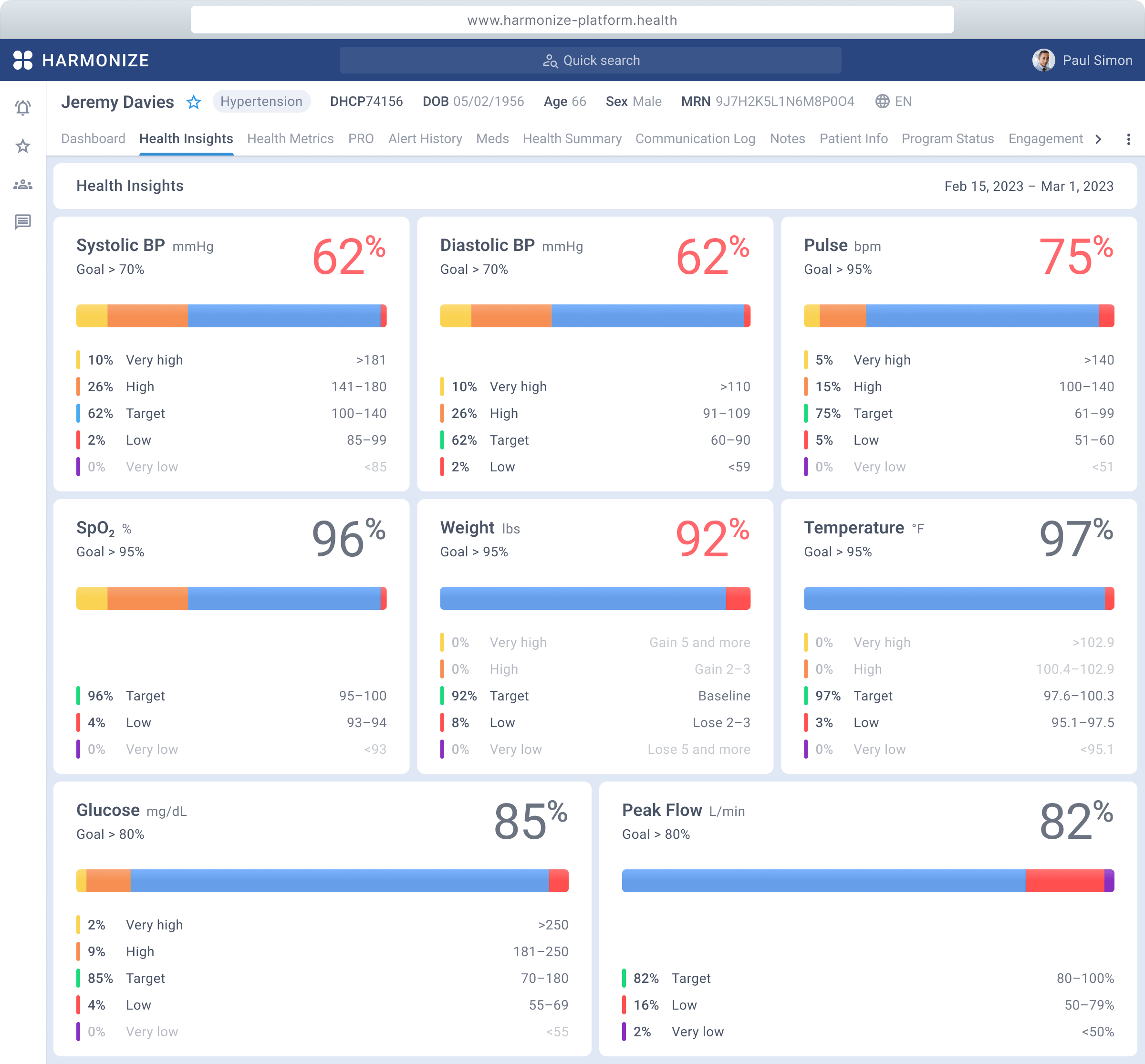
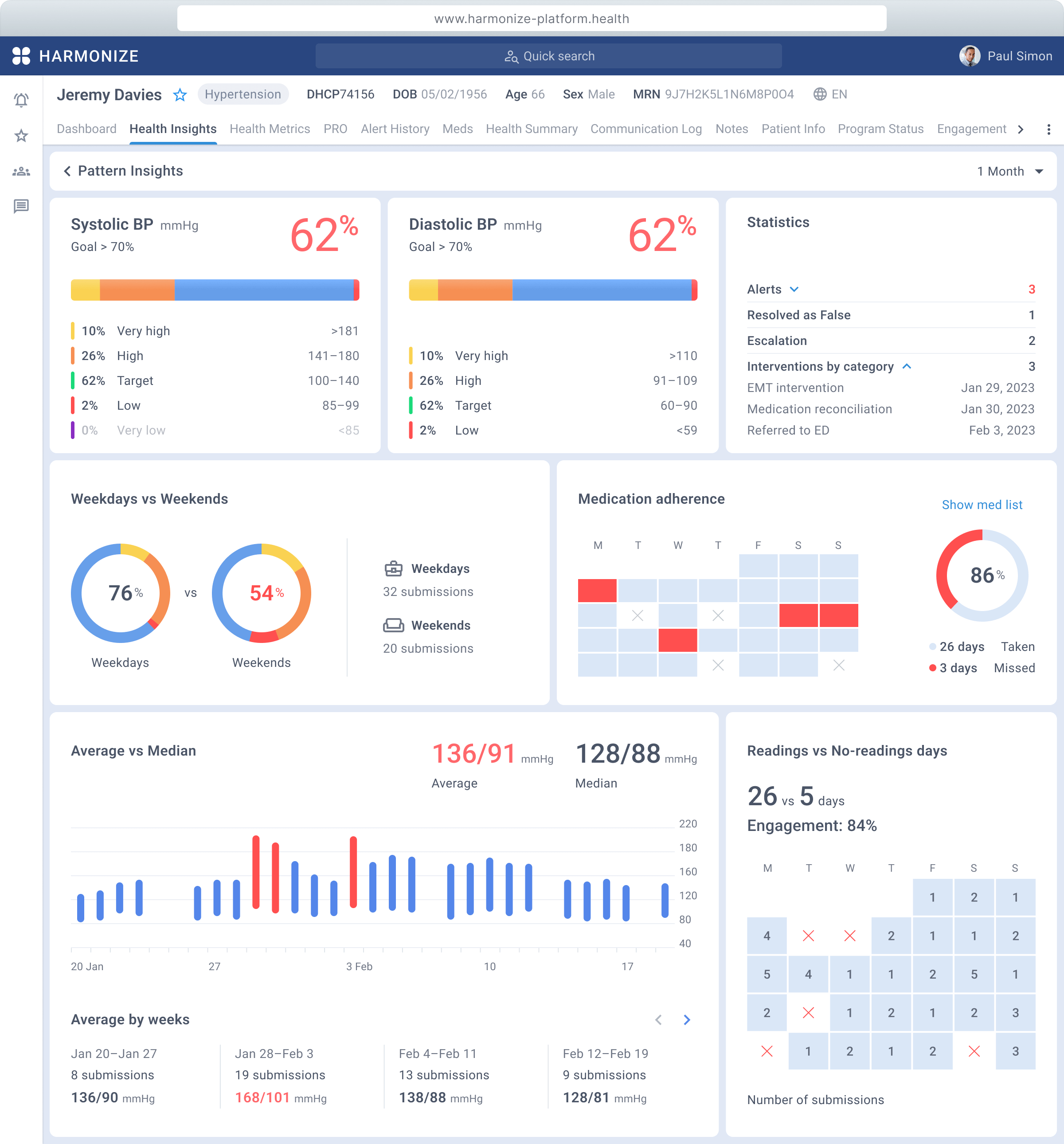
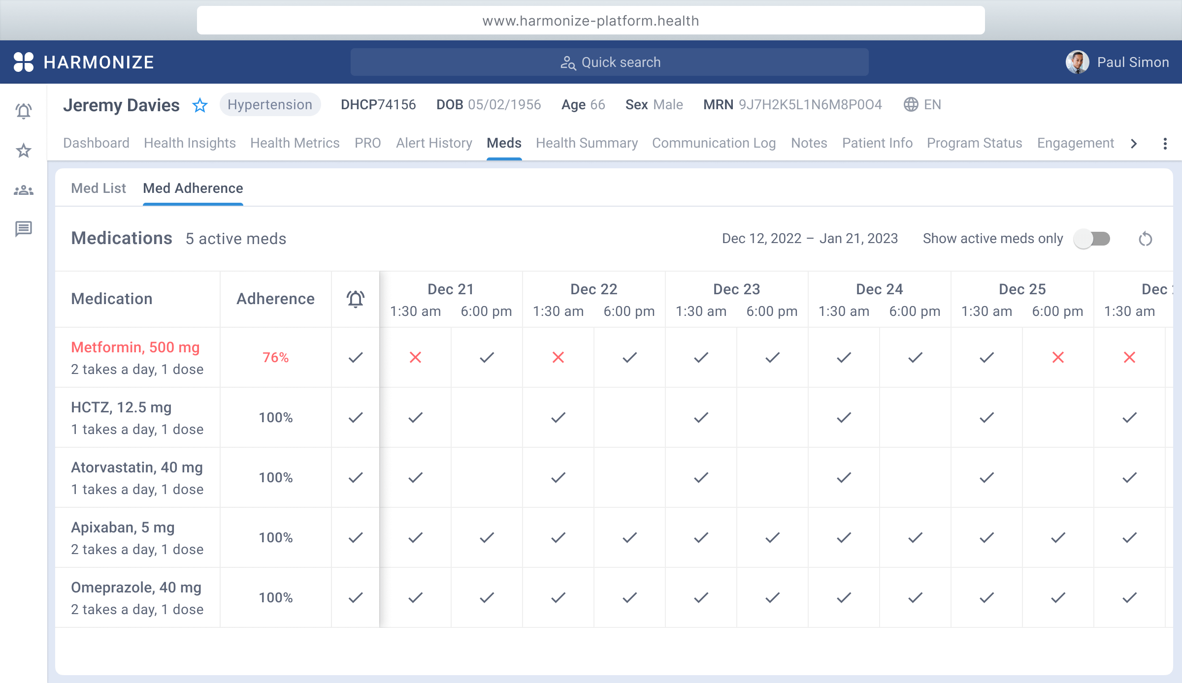
Design of the sophisticated and intuitive platform that has been using by a number of leading healthcare providers, including Intermountain Healthcare, Choice Medical Group, MedStar, P3 Health Partners, and Stanford Health Care.

Harmonize web platform. Patient profile

Design System

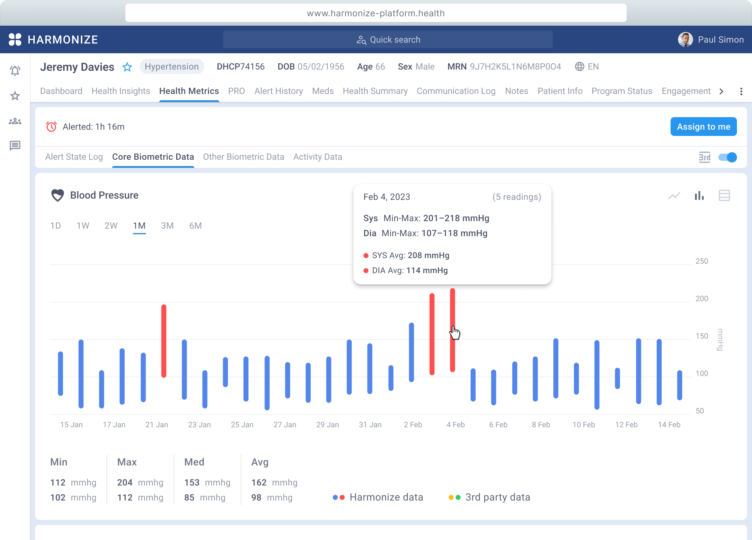
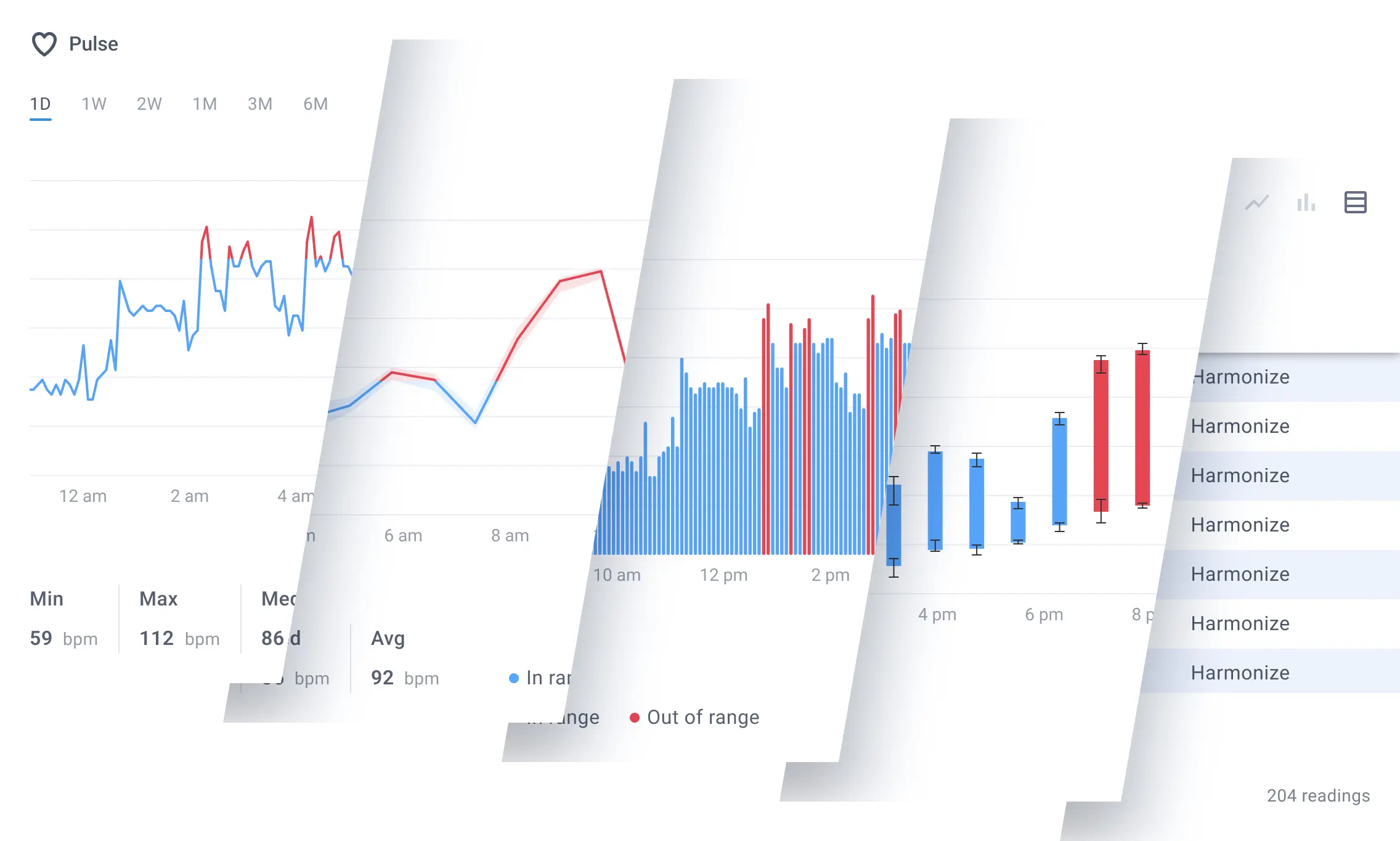
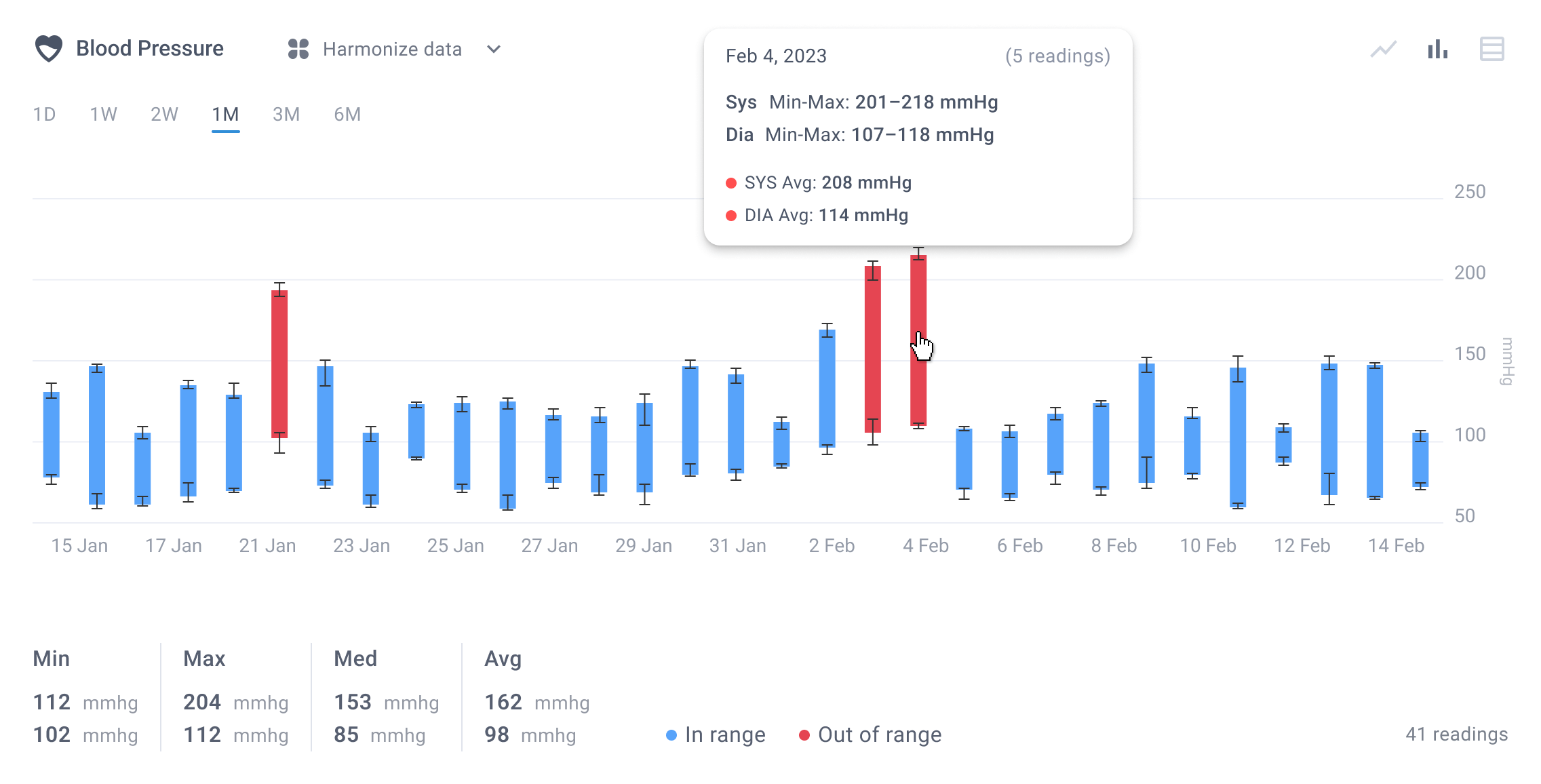
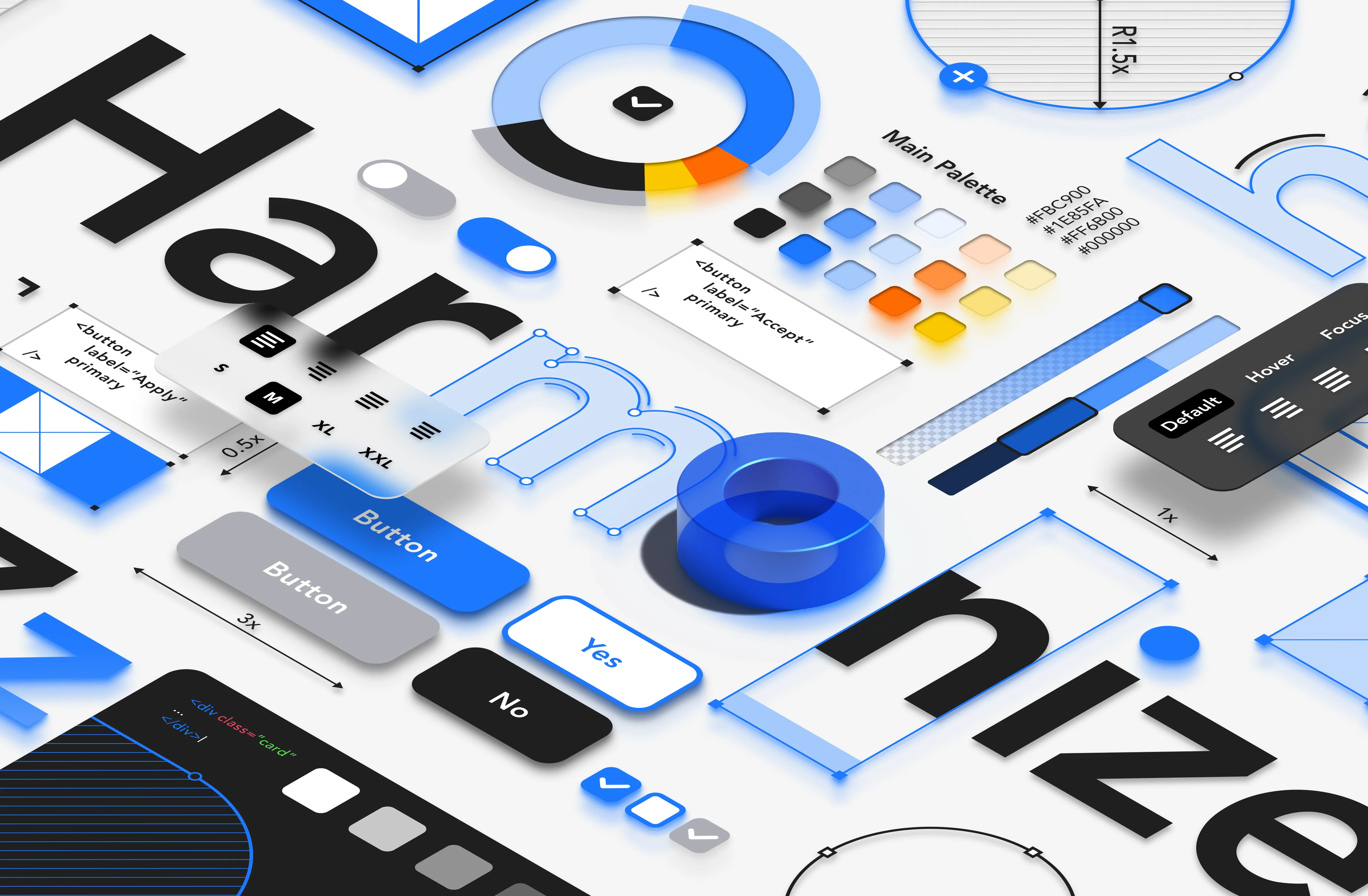
As Harmonize service has the web platform and cross-platform mobile apps, development of the design system became apparent. This system is a potent instrument, fostering the virtues of consistency, efficiency, scalability, collaboration, and brand integrity throughout the entirety of the design and development process.

Design System

Data View

To enhance the visualisation of specific data, a range of diverse charts has developed that provides comprehensive insights. Users have the flexibility to switch seamlessly between line, column, and table views to get data in the way that is most helpful to them.

three charts
blood pressure chart

Blood Pressure

As the chart employs a unique data structure, it was necessary to create a distinct graph type to ensure its accurate visualisation.

Blood pressure chart

Patient Profile

Whole Platform UI has been designed from scratch, and one of the most important sections is patient profile. This central repository contains all necessary information about a patient's health, including the latest trends and conditions. Providers quickly and easily access all they need.

Health insights main pattern

Multilevel Structure

Information architecture of the platform sections underwent rigorous design and user testing, resulting in an enhanced ability to interact with any level data. This, in turn, has led to a significant increase in the number of patients that can be processed within a given timeframe.

Health insights bp pattern

Medication Control

The Medication section is one of the platform’s vital components. With the mobile app, patients are empowered with full control over their medication and are alerted by notifications to ensure they never miss a dose. And healthcare providers in turn are able to stay up-to-date on patients' medication adherence, allowing them to provide tailored care and treatment.

Mobile Experience

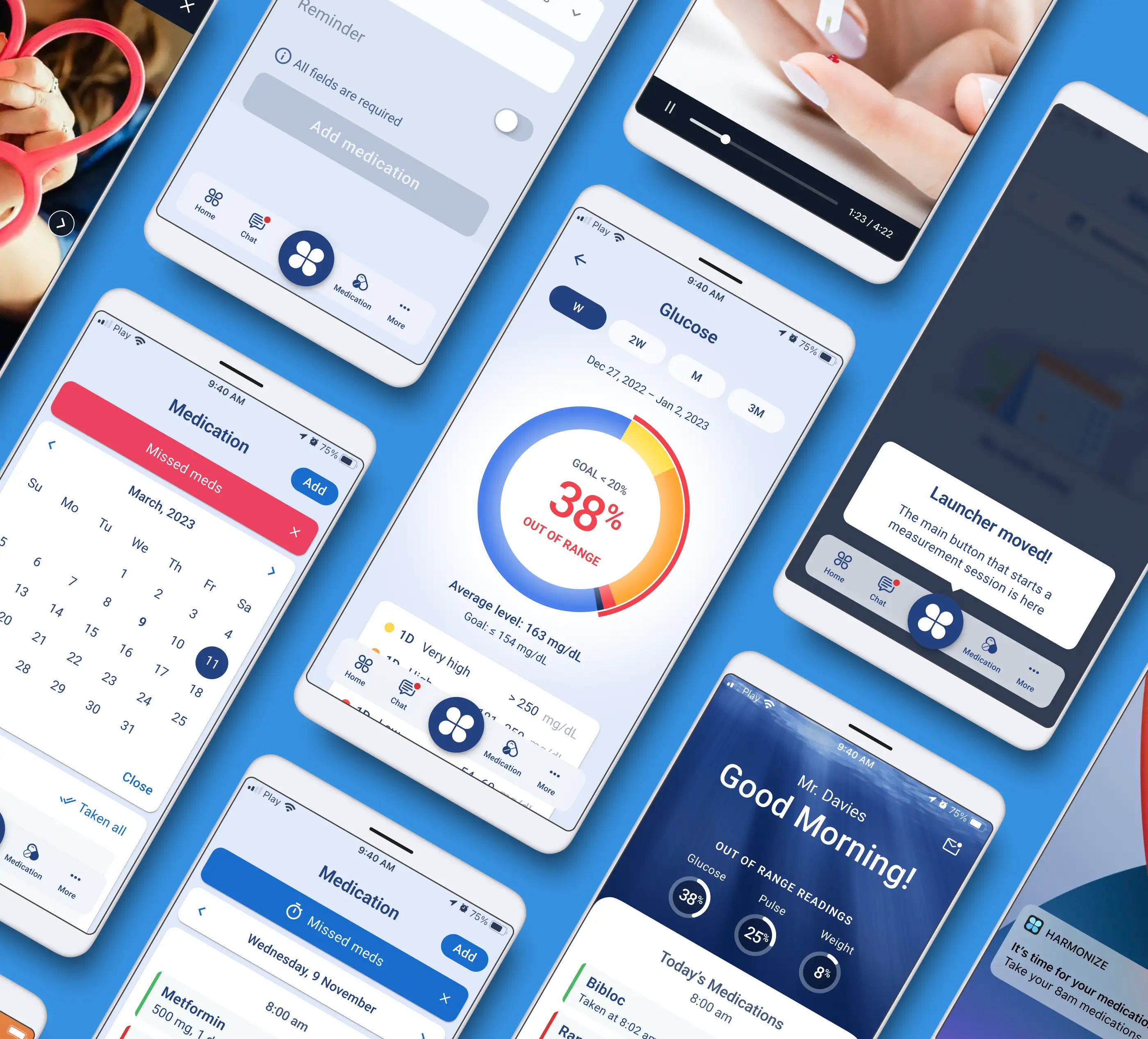
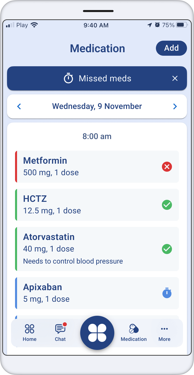
The mobile app has been thoughtfully designed to run smoothly on both Android and iOS platforms. To ensure a seamless user experience, extensive testing conducted and incorporated insights from age and physiological characteristics of patients. This attention to detail has resulted in the app that is intuitive, easy to use, and tailored to the specific needs of patients.

Mobile app design

White Labelling

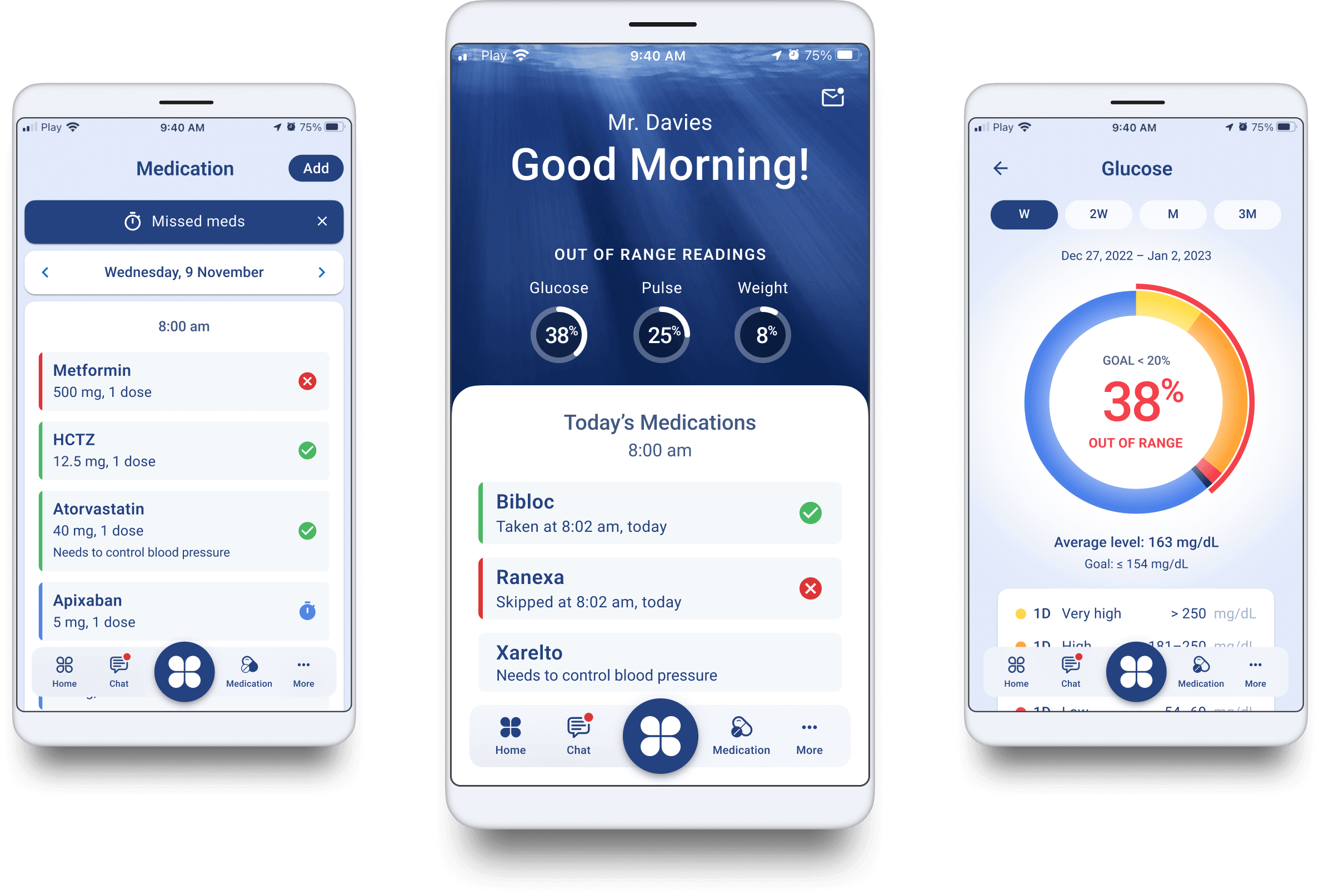
With numerous sections and hundreds of screens in the mobile app, it offers a white-label feature that enables each provider to use their own colour palette. Almost all interface elements, including fonts, controls, and even diagrams, can be customised with brand colours.

Many screens